AI Ad Manager
My role
UX Design Lead
AI Ad Manager revolutionizes advertisers’ workflow with its all-in-one platform, designed to improve efficiency and save costs. With our innovative technology, advertisers can now complete one campaign within 7 minutes, increasing the efficiency by 88%!
Skill used
User Research, Competitive analysis,
A/B testing, Prototype, UI design
Awards
Red Dot Design Awards, Design Concept, 2024
Red Dot, Brands&Communication Design, 2024
Gold Award, London Design Awards, 2024
Indigo Design Awards, Gold, 2024

2024

Team structure
Me(Design Lead)
Yasong Wang (UX Designer)
Hong Qiu (Product Manager)
Time frame
Two months
This is one of my proudest projects when I worked as an user experience designer in 2024.
AI Ad Manager is an all-in-one platform that revolutionizes the ad industry. Leveraging AI-driven bidding suggestions, precision audience targeting via machine learning, and real-time predictions, it offers a comprehensive dashboard, premium campaign, and customizable report. Anticipated improvements include a 88% efficiency boost in campaign setup and an 85% reduction in communication cost.
Overview of Design Highlight
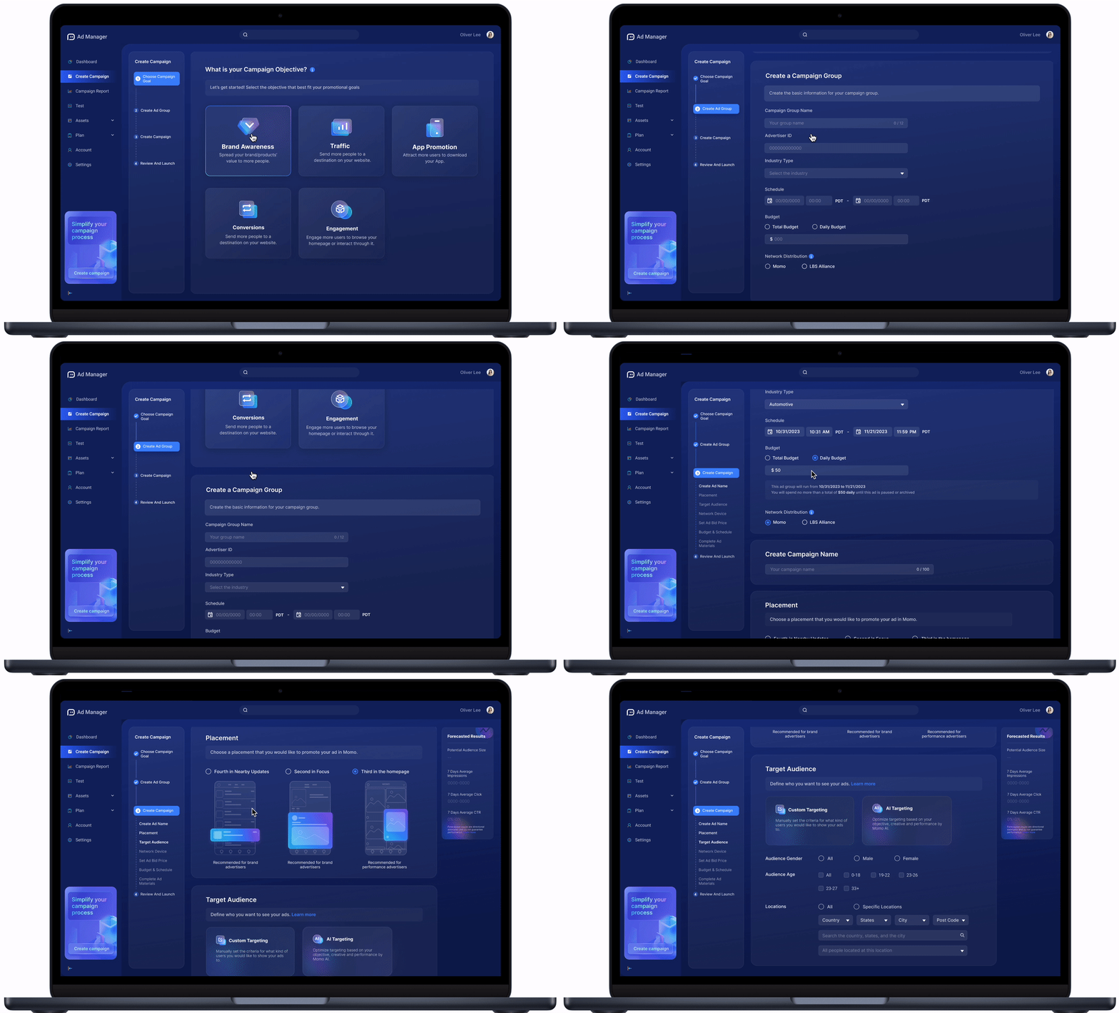
Streamline the Filling Process
Enhances efficiency, reduces costs, fosters collaboration, and ensures consistency to improve overall campaign performance and user satisfaction.
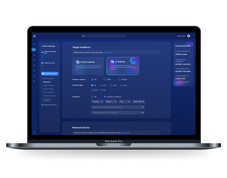
AI Audience Target
Eliminate uncertainty with AI-guided advertising bidding, empowering users to make informed, data-driven choices and predict campaign results with precision.
AI Bidding
Enhances efficiency, reduces costs, fosters collaboration, and ensures consistency to improve overall campaign performance and user satisfaction.
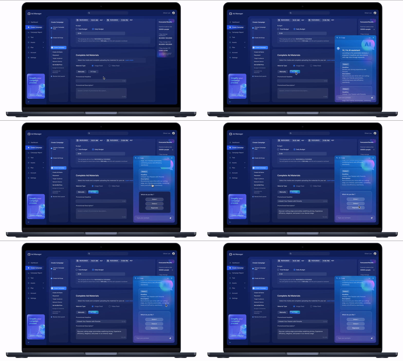
AI Copy
Eliminate uncertainty with AI-guided advertising bidding, empowering users to make informed, data-driven choices and predict campaign results with precision.

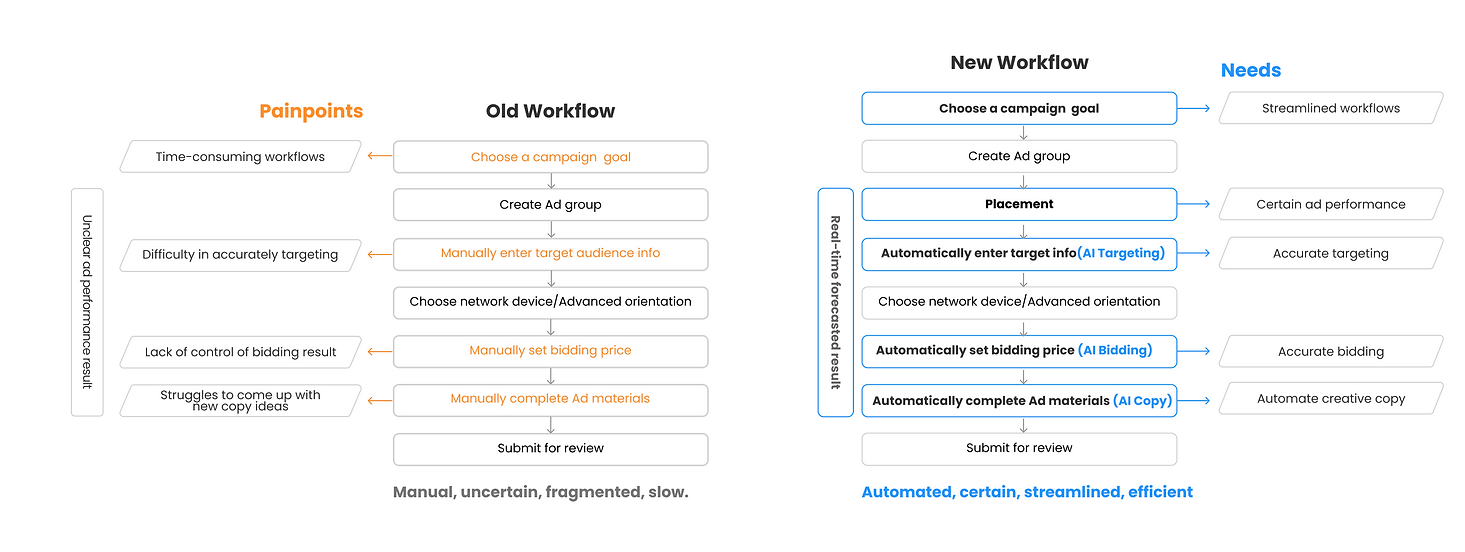
🤌 Who are our users?
🤌 What are users‘ pain points and needs?
🤌 What do we change based on old workflow?
🤌 What are the design rationales?
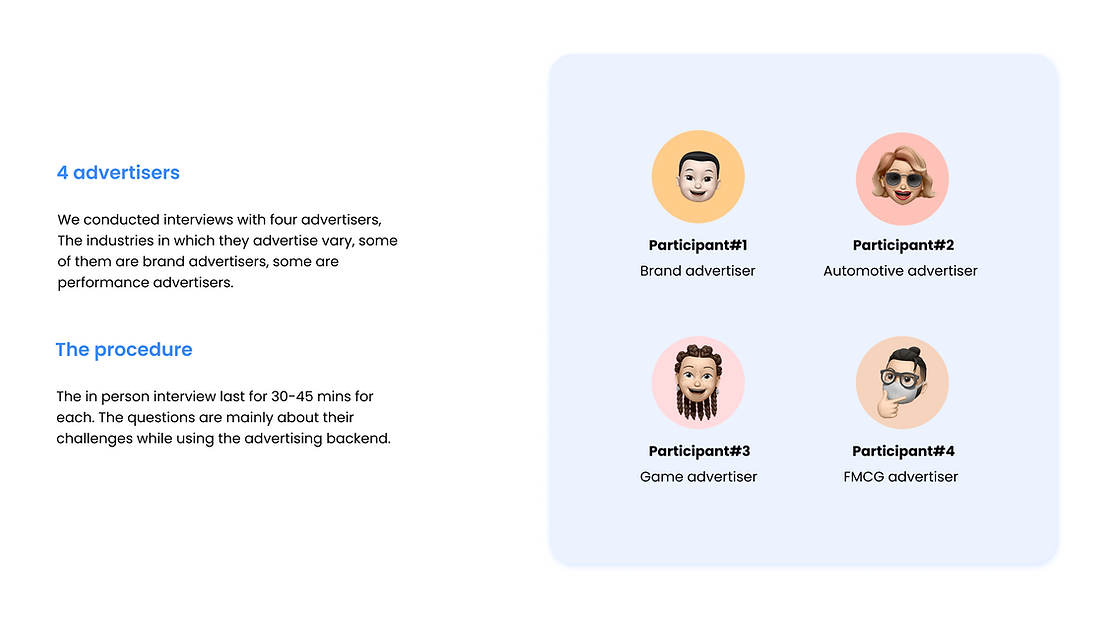
To understand our users, we started user research to better understand users’ pain points and needs.
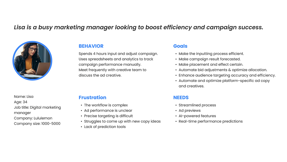

Painpoints & Needs



Easy to miss the first step
Confusing left & Right layout
Fragment
The left-right layout caused users to overlook the first step and expect the right-side form to update based on their objective choice, leading to confusion. The mismatch in interaction logic and lack of clear step numbering made the process feel fragmented. A structured, numbered flow will improve clarity and efficiency.
In response to feedback, I have developed two structural versions to break down the process into distinct steps. Additionally, I have explored both horizontal and vertical layouts for navigation to determine which best enhances user experience.
With a highly iterative process, I created user flows and mocks from low fidelity to high fidelity.
Meanwhile, we did a clickable prototype and iterate it based on the users’ feedback.
Option 01: Horizontal Version
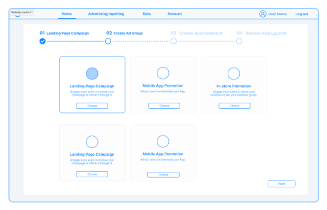
Streamline the process
Break down the process into steps
Tracking progress bar
Limited Space
Restricted Dropdowns
Alignment Issues on mobile device
Option 02: Vertical Version
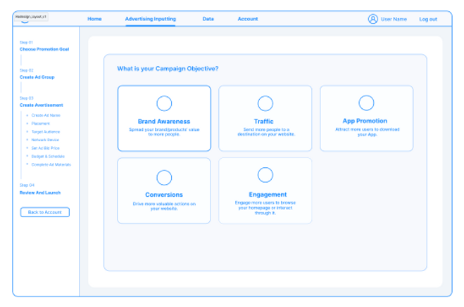
Better dropdown support
Responsive - friendly
Streamline the process
Break down the process into steps
Tracking progress bar
Due to the abundance of details in the substeps, we opted for the vertical layout. In this configuration, the process is easily trackable, providing clarity and facilitating seamless navigation.
I conducted an internal usability testing to see which version works better for the users in the internal team. I asked 200 people to use both of the version and ask their preferences.
67.3% people prefer vertical one. 32.7% people prefer horizontal version.
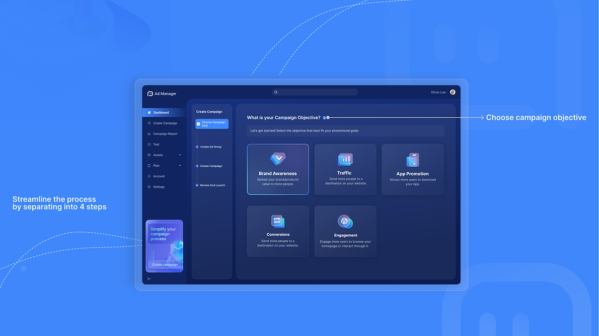
Better dropdown support
Responsive - friendly
Streamline the process
Break down the process into steps
Tracking progress bar
Old Design
Placement
Unclear expression
Uncertain placement effect
Confusing option
Uncertain ad performance result
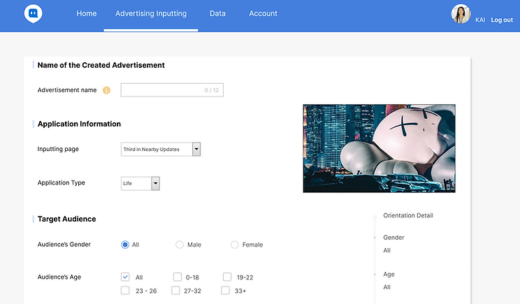
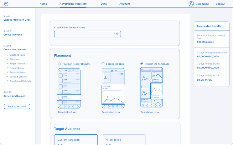
Visualize previewing the placement
Real-time forecast result
Low-fidelity
Placement & Result Forecast
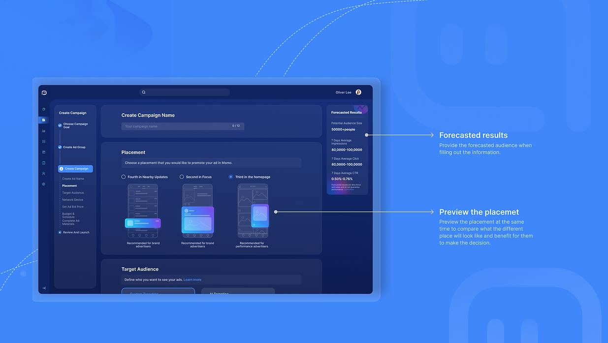
High-fidelity
Placement & Result Forecast
Visualize previewing the placement
Real-time forecast result
Campaign Preview
Old design
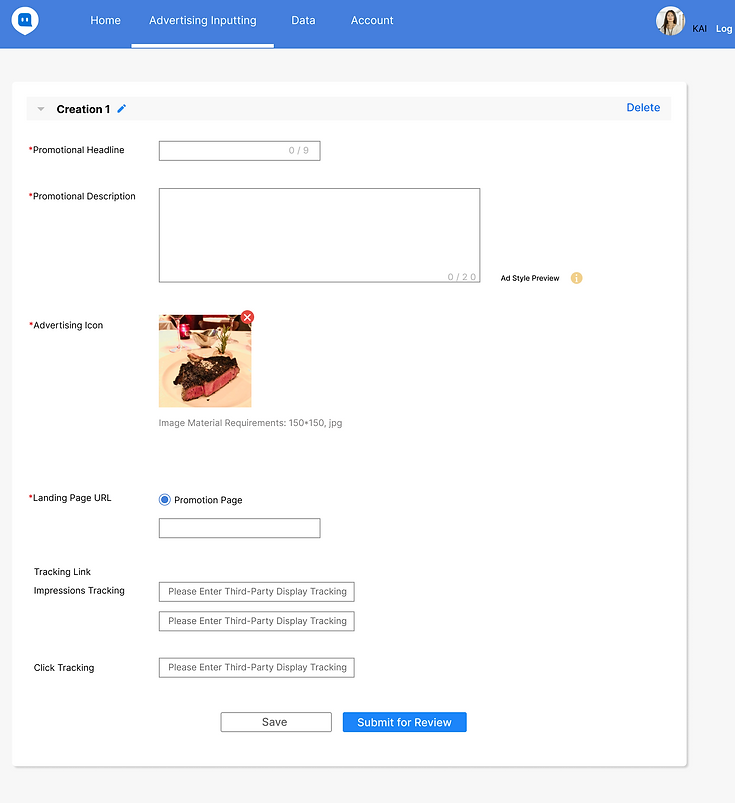
Uncertain campaign inputting result
Uncertain campaign effect
Campaign Preview
Low-fidelity
Option 01
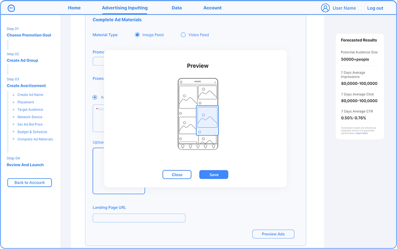
Cons
Preview the campaign effect right after filling material
Pros
Jump and interact frequently
Option 02
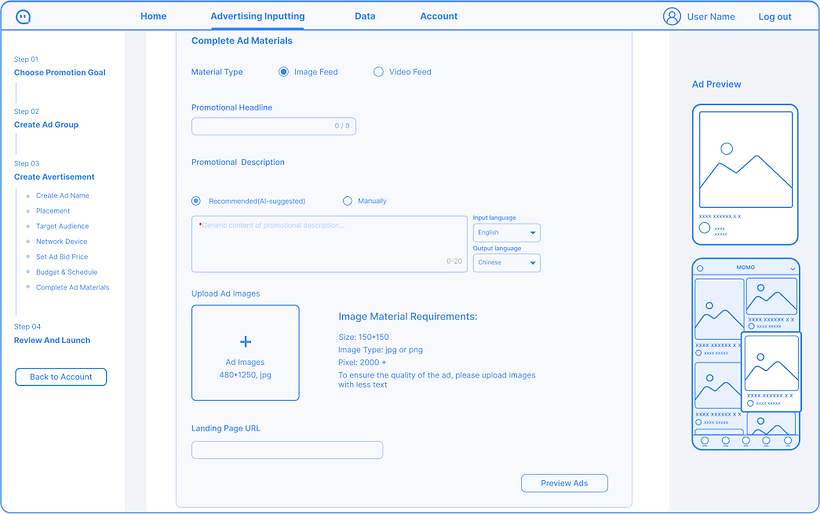
Cons
Real-time preview of the campaign
Efficiency
User's feedback
I want to quickly preview what the campaign looks like on the platform so that I could adjust the materials and strategies instantly to save time and effort.
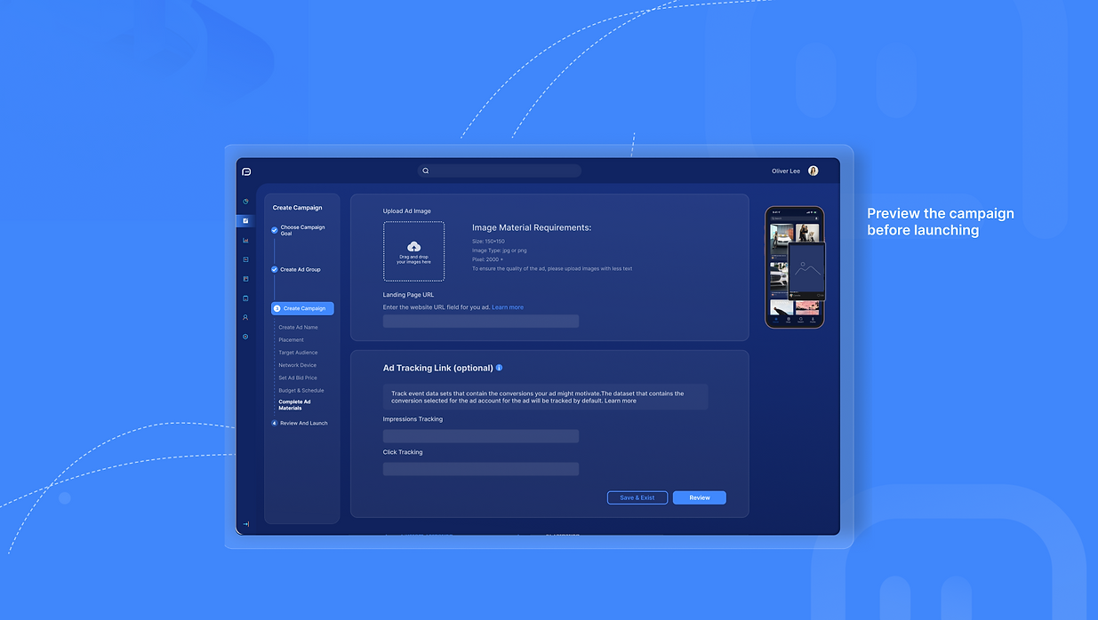
High-fidelity
Real-time Campaign Preview
AI Study
How to solve the users' painpoints with AI?
-
Difficulty in accurately targeting
-
Struggles to come up with new copy ideas
-
Lack of control of result
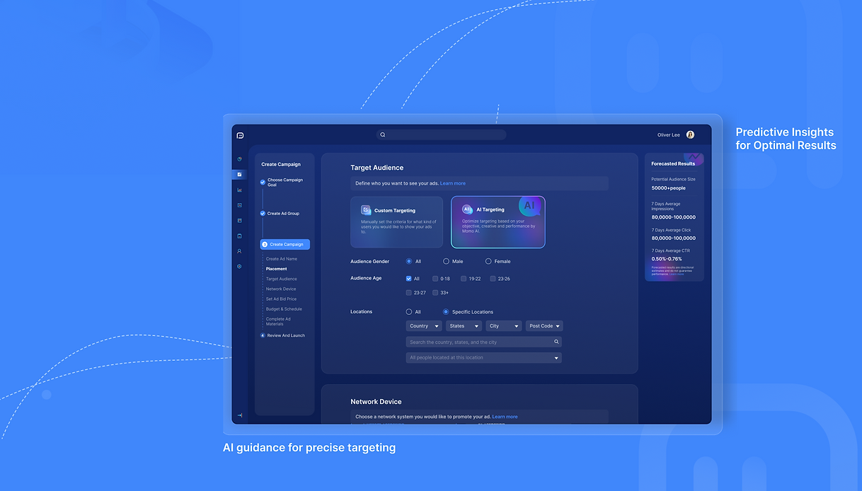
AI Targeting
Scenario: Precision audience segmentation for better reach.
AI Pattern: One-click apply
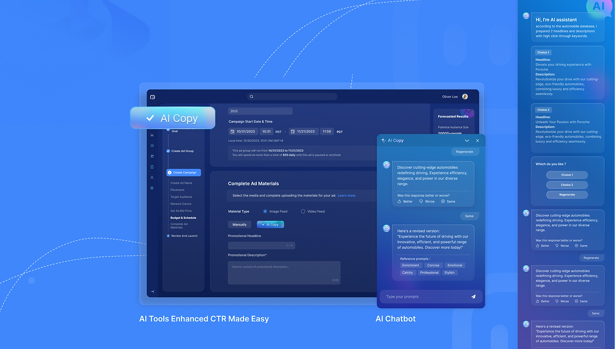
AI Copy
Scenario: Automatically generates and tests ad creatives.
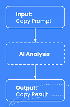
AI Pattern: One-click apply
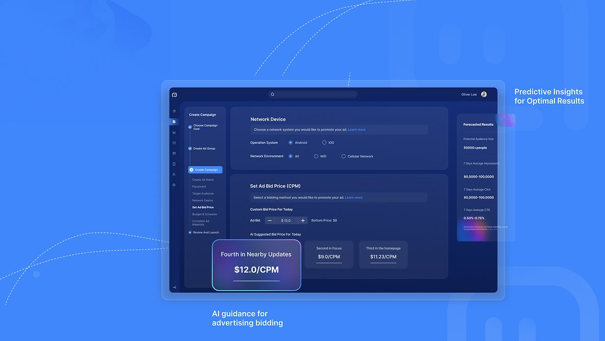
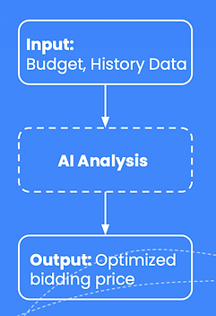
AI Bidding
Scenario: Real-time bid optimization for conversions or ROI.
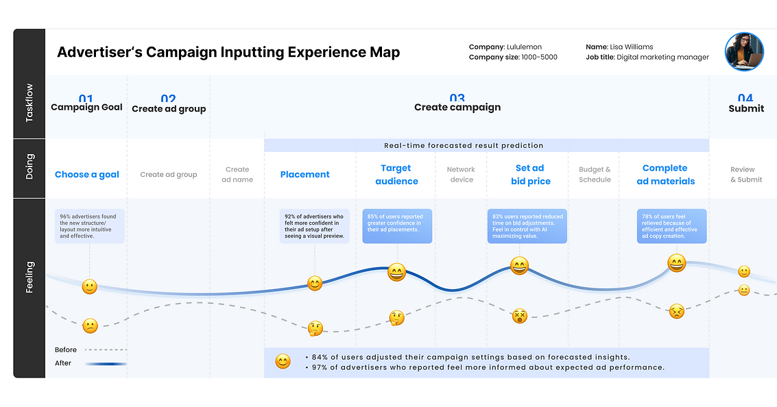
We asked 6 advertisers to complete the campaign inputting process. The average completion time is 7 minutes.
Comparing to the average finishing time of 1 hour, the task-completion efficiency increased 88%.

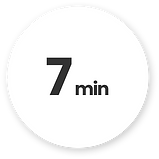
Reduce task-completion time
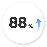
Task-completion efficiency

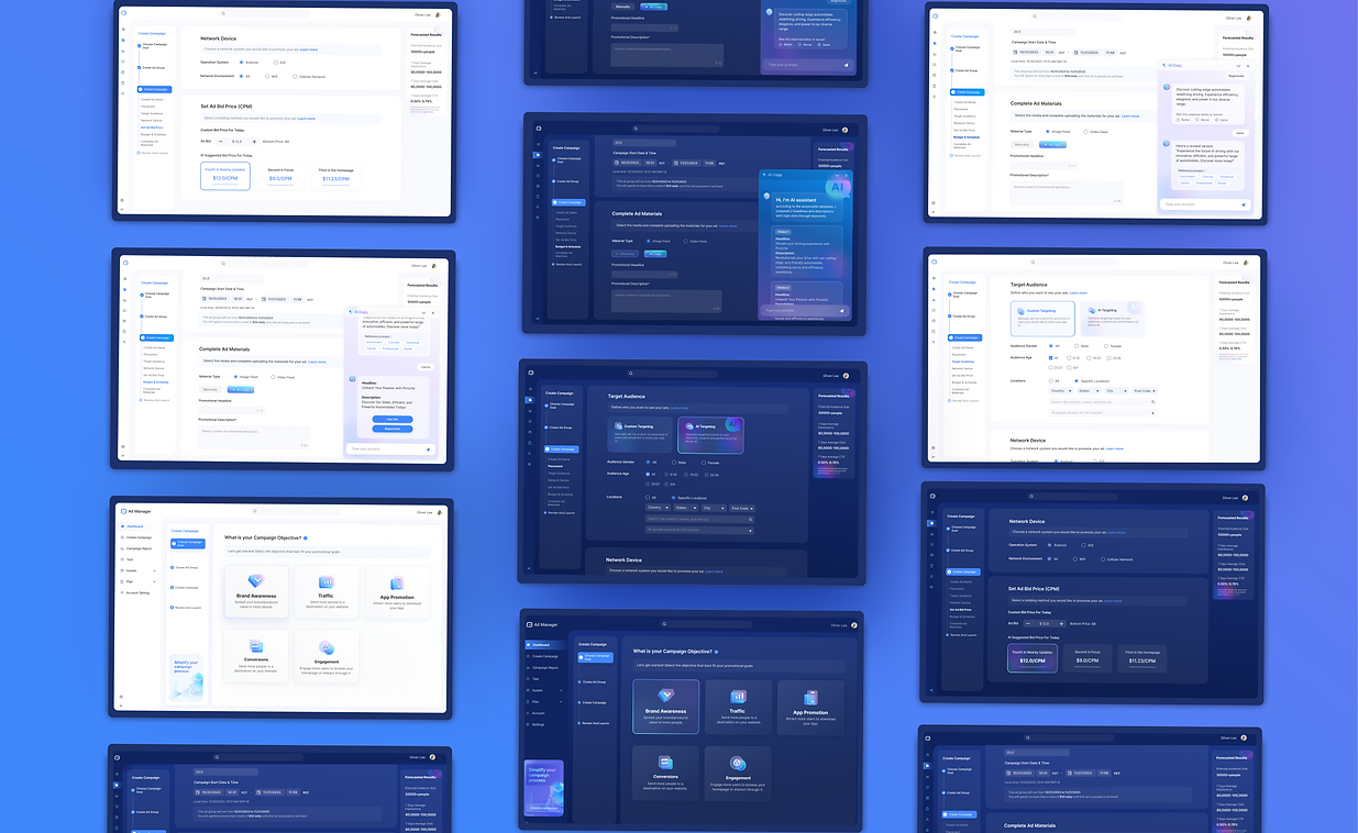
Light mode & Dark mode
Next Step
-
Optimize the AI copy and tailor it to different scenarios
-
Get user feedback about the AI feature precision and optimize the AI model.


